BRP WORLD
ART DIRECTION
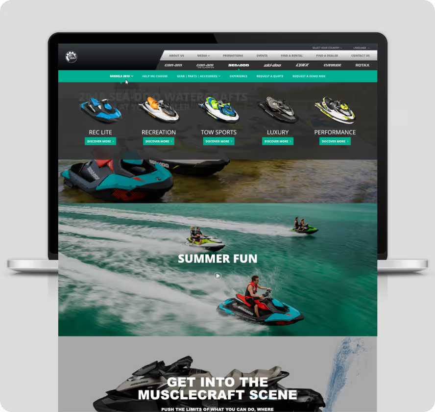
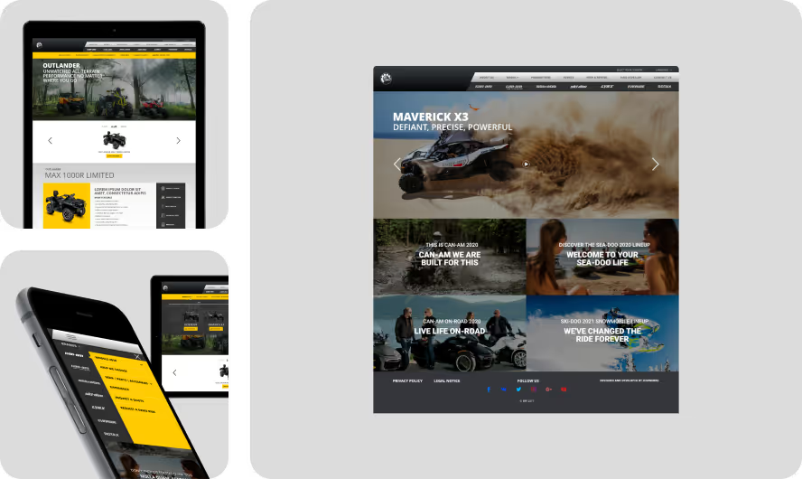
BRP World, a globally recognized brand, needed a website redesign to reflect better their motto, “WE RIDE FOR THE JOURNEY, NOT THE DESTINATION.” The transformation focused on pixel-perfect user interface enhancements to align with BRP World’s vision.
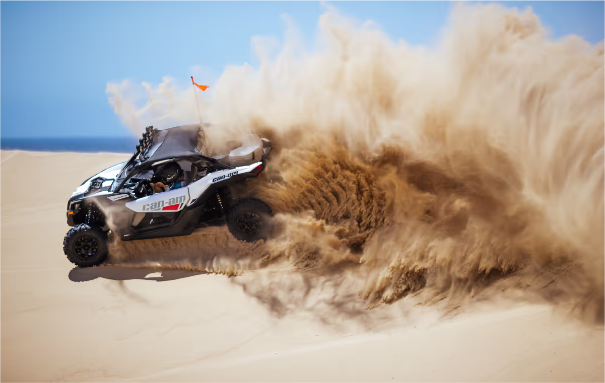
High-quality, dynamic imagery of BRP products in action was used to create an immersive user experience. Distinct color palettes for each brand—Ski-Doo, Lynx, Sea-Doo, Can-Am, Evinrude, and Rotax—were meticulously applied to evoke the energy and thrill of riding. This design solution ensured every pixel contributed to a cohesive and engaging visual narrative.
I meticulously applied distinct color palettes for each brand—Ski-Doo, Lynx, Sea-Doo, Can-Am, Evinrude, and Rotax—leveraging their unique color associations to evoke energy, intensity, and the thrill of riding.
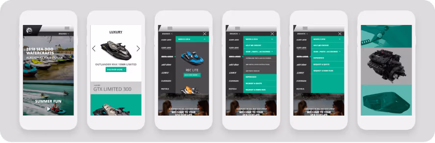
The navigation was overhauled to streamline user flows and improve information architecture, making it easier for users to find what they needed. The responsive design ensured a seamless experience across devices, with pixel-perfect precision.
Multilanguage support was integrated to cater to BRP World’s global audience, enhancing accessibility. Web forms were optimized with grouped-related information and inline validation to prevent errors and ensure smooth user interaction. Clear field labels and pixel-level attention to detail improved usability.
The redesigned user interface embodied the spirit of adventure, speed, and innovation, transforming every pixel into an unforgettable journey.
NEXT PROJECT
NEBIA