ICC

ART DIRECTION
BRANDING
The International Code Council (ICC) faced several challenges that required strategic solutions to achieve brand cohesion. ICC needed to unify its various sub-brands, ensuring a seamless experience for users across all touchpoints.
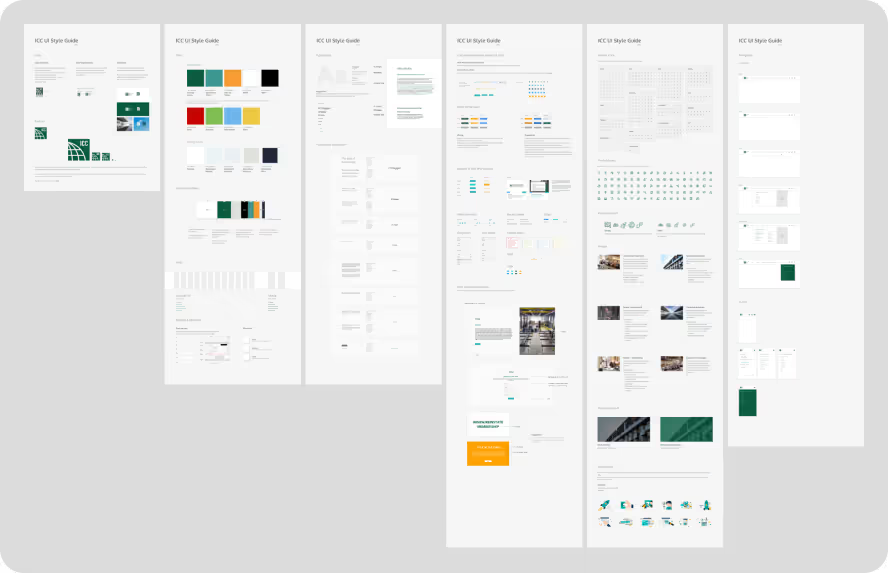
Our approach involved conducting a comprehensive audit to understand ICC’s offerings and value proposition, analyzing existing interfaces, and identifying pain points and opportunities for improvement. Based on insights from the audit, we developed a long-term, unified message. The user interface played a key role in aligning visual elements with this messaging, ensuring consistency.
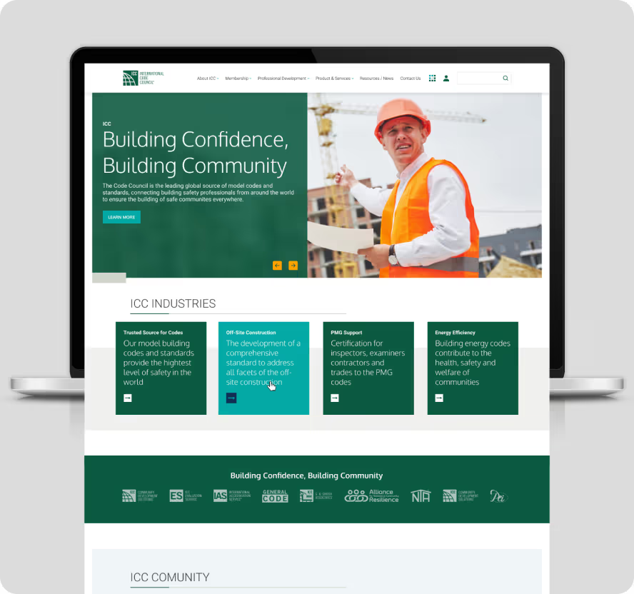
Geometric shapes, such as squares and rectangles, were strategically used to bridge construction concepts with visual elements as part of the art direction.
The use of geometric shapes in the branding was particularly significant. Squares and rectangles resonate with construction themes, symbolizing stability, structure, and precision—core values in the construction industry. These shapes provided a visual metaphor for the reliability and robustness of ICC’s standards and services. By integrating these geometric elements into the design, we reinforced the connection between ICC’s visual identity and its mission, creating a cohesive and meaningful brand experience.
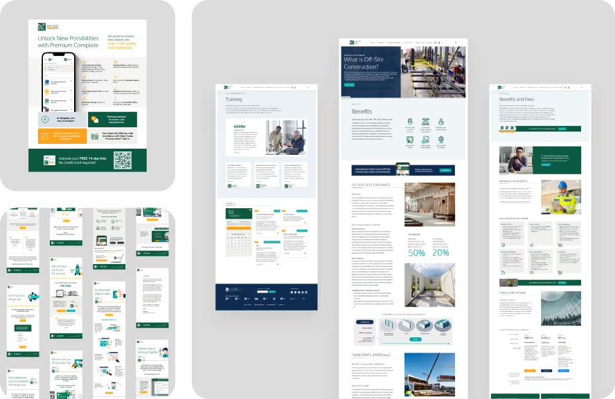
The visual solution resulted in ICC emerging as a 30-year-old “new” brand, with refreshed messaging and a cohesive identity. Digital assets, including social media campaigns, emails, and landing pages, reflected the unified brand identity.


NEXT PROJECT
BRP
